Concept A – 2016 Sacramento National Antique Bottle Convention Logo Design
2016 Sacramento National Antique Bottle Convention Logo Designs
02 October 2014 (R•100514)
 I had some time this morning in the airport and on the flight home to put together some rough, low-res logo concepts for the 2016 Sacramento National Antique Bottle Convention logo designs. This art will follow the art used for the 2014 Lexington National Antique Bottle Show and the upcoming 2015 Chattanooga Antique Bottle Show and be used for advertising, promotion, banners, posters etc.
See Round 2: Pony Express Concepts
2014 Lexington National Antique Bottle Show Logo
2015 Chattanooga National Antique Bottle Show
I have used a Sacramento Madison Avenue sculpture image of Atlas Holding up the World. This is symbolic of the FOHBC unifying the collecting hobby and clubs. This is also a “going back to our roots’ convention as the Federation originated in Sacramento. Please review the art and let me know your favorite. Send to fmeyer@fohbc.org. Gracias!
PS: Do not be fearful that there is no FOHBC logo or lots of bottles. This can be added as support imagery.
Concept B – 2016 Sacramento National Antique Bottle Convention Logo Design
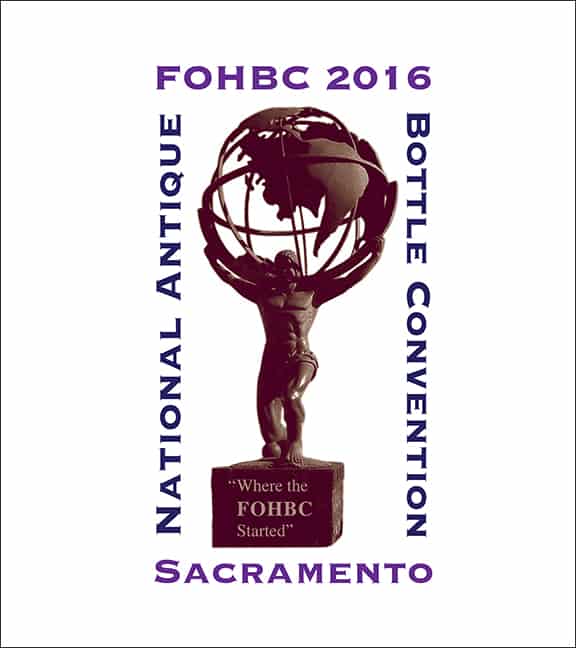
Concept C – 2016 Sacramento National Antique Bottle Convention Logo Design
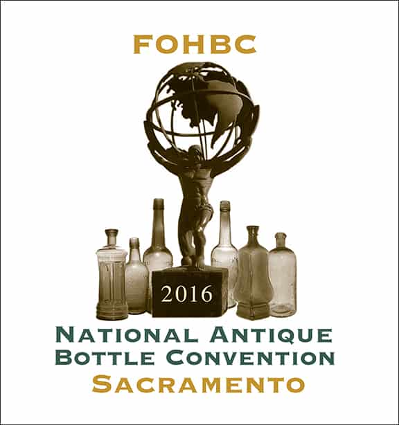
Concept D – 2016 Sacramento National Antique Bottle Convention Logo Design
About Ferdinand Meyer V
Ferdinand Meyer V is a native of Baltimore, Maryland and has a BFA in Fine Art and Graphic Design from the Kansas City Art Institute and School of Design. Ferdinand is the founding Principal of FMG Design, Inc., a nationally recognized design consultation firm. Ferdinand is a passionate collector of American historical glass, specializing in bitters bottles, color runs, and related classic figural bottles. Ferdinand is married to Elizabeth Jane Meyer and lives in Houston, Texas, with their daughter and three wonderful grandchildren. The Meyers are also very involved in gardening (Peachridge Gardens), antiques (Peachridge Collections), and early United States postage stamps. Ferdinand is the past three-term president of the Federation of Historical Bottle Collectors, a long-time board member, FOHBC 2021 Hall of Fame, and one of the founding members of the FOHBC Virtual Museum.
![]() I had some time this morning in the airport and on the flight home to put together some rough, low-res logo concepts for the 2016 Sacramento National Antique Bottle Convention logo designs. This art will follow the art used for the 2014 Lexington National Antique Bottle Show and the upcoming 2015 Chattanooga Antique Bottle Show and be used for advertising, promotion, banners, posters etc.
I had some time this morning in the airport and on the flight home to put together some rough, low-res logo concepts for the 2016 Sacramento National Antique Bottle Convention logo designs. This art will follow the art used for the 2014 Lexington National Antique Bottle Show and the upcoming 2015 Chattanooga Antique Bottle Show and be used for advertising, promotion, banners, posters etc.




I like concept B, and your phrase “going back to our roots”. I had thought about the phrase “where it all began”. Really hoping that this inaugural convention in California is one for the history books!
Hey Ferd, I lean toward Concept D, but I would try using a narrow stroke sans serif for “NATIONAL ANTIQUE BOTTLE CONVENTION” to eliminate that “eye chart” look and have all the lettering the same color as the darkest of the items in the picture. I haven’t tried it on this layout, so it may not pan out as I envision it. Thanks for listening and for all you do for us, Jimmy (Bray)
Will the average collector really relate Atlas holding up the world to the Federation or to antique bottles? It’s turn-of-the-century industrial look is dark and heavy. How about something more symbolic of and identifiable with the West; new opportunity, growth; prosperity…the gold rush.
Randy Selenak – I used to praise and compliment Ferd on his graphic design but this logo is ridiculous and really sucks!!!!!