O K P L A N T A T I O N B I T T E R S
the “B I G B O Y S”

If you remember, some time back, towards the end of last year and the beginning of this year, I did an extensive series on triangular bitters bottles. It was a fun series. I purposely withheld my favorite, the OK Plantation Bitters as I consider it in almost a separate category all by itself. Sure it is triangular, but in my book it is the king of bitters, my absolutely favorite brand and form. This says a lot to those that know me because I have major runs of queens, fish, cabins, pigs and corns.

O K P L A N T A T I O N S
“These guys are monsters of engineering representing the pinnacle of power.”
I am also a train nut and absolutely love the early trains of yesteryear, model railroading, rail-fanning and to this day still subscribe to Model Railroader magazine. If I won the lottery, my dream would be to build a 10,000 sq ft HO model railroad based on the Baltimore and Ohio Railroad in the 1940’s. With train lovers, we all have a favorite locomotive and mine is the “Big Boy”. The Big Boy was the name of the Union Pacific Railroad’s 4000-class 4-8-8-4 articulated steam locomotives, built between 1941 and 1944 by American Locomotive Company (ALCO). The 25 Big Boys were the only locomotives to have the 4-8-8-4 wheel arrangement, which combined two sets of eight driving wheels with a four-wheel leading truck for stability entering curves and a four-wheel trailing truck to support the large firebox. These guys are monsters of engineering representing the pinnacle of power.

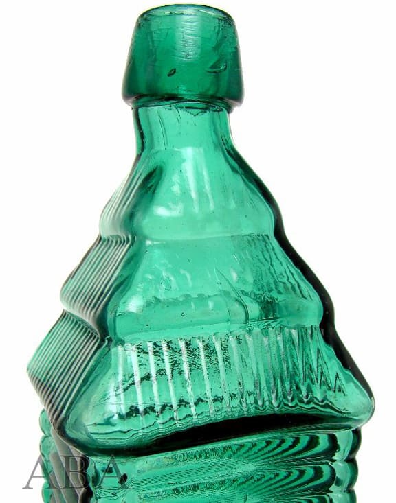
Why am I telling you this? Well I consider the OK Plantations my “Big Boys”. They are bigger than most of my other bitters bottles, they are a Lediards (New York) product in a cabin form, triangular, have windows, ribbed, articulated to no end and as either Bob Currens or Mark Warne once said, “They are a Drakes Plantation Bitters on steroids”. These bottles haul the freight and are my 4-8-8-4’s of my bitters bottles. The OK’s actually come in two mold variants, the second being a little wider and having a shorter neck. You get my point I hope. I do want to mention that the word ‘BITTERS’ is not embossed on the bottle. This doesn’t bother me or hinder me for a moment.
Read: Charles Lediard and his Liquor Products
The Carlyn Ring and Bill Ham listing in Bitters Bottles is as follows:
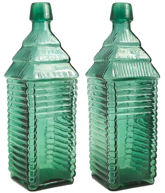
O 13.5 OK PLANTATION, Circa 1863 – 1875
OK / PLANTATION / 1840 // motif 7 vertical ribs // motif 7 vertical ribs //
// s // PATENTED ( au ) / OCT. 13TH / 1863 // motif window // motif window //
11 1/4 x 3 (6 3/8) 3/4
Triangular, Amber and Puce, LTC, Applied mouth
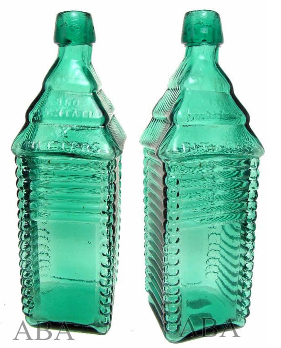
OK / PLANTATION / 1840 // motif 7 vertical ribs // motif 7 vertical ribs //
// s // PATENTED ( au ) / 1868 // motif window // // motif window //
11 1/4 x 3 (6 3/8) 3/4
Square, Amber, Puce, Apricot, and Olive amber, Applied mouth, LTC
Note 1: a product of Charles Lediard – New York
Note 2: there is also an unembossed variant
I had a crazy week this past Monday thru Friday as I had eleven different client meetings in seven different cities in Kentucky (Paducah, Madisonville, Lexington, Corbin, Louisville, Richmond and La Grange). While chilling at a Starbucks in Louisville between meetings this past Friday morning, I saw a surprise picture with a tease question and picture (see below) posted by Tami Barber on my Peachridge Glass facebook page.

“This is what I would guess is Strawberry Puce? Guess the bottle?” – Tami Barber
 Tami asked…
“This is what I would guess is Strawberry Puce? Guess the bottle?”
Wow…what a way to catch my heart girl (sorry Ed). I immediately perked up, took a much deserved bottle break and responded…
“For those that know me and my collection best, my favorite bottle…OK?”
It’s great how we can get so fired up with a simple post about the bottles and glass we love. Like proudly pulling out a picture of our children, grandchildren or pets. That is what makes our hobby so great. With facebook and instant communication, we can be with our bottles and collector friends anywhere and anytime we want. I was immediately and spiritually back with my collection in Houston and excited. I was the proud popper as my grandson Nicolas calls me. I quickly followed up with a post of my OK run in a linear layout (see below) that prompted further dialog, primarily with Jeff Noordsy. This kept the train of thought moving forward with comments like:
“Two variants. One is wider and shorter. Just soooo cool…AND TRIANGULAR!!!!” Ferdinand Meyer V
“Really? I very much like these as well. I always figured that the Drakes were your faves.” – Jeff Noordsy
“Holy $hit. That is a fantastic run. Different necks from one to the other.” – Greg Sweet
“I can’t tell you how impressive these are. MAGNIFICENT!” -Rick Ciralli
“Outstanding color group run Ferd !!!!!!” – Dale Santos
“You’re killing me! Best colors in town!” – John Panella
“Very Nice! Great run!” – Brian Shultis
“Hard to find a single one of those bottles let alone a run like that. Congratulations Ferd. I think we all know the difficulty in assembling this “run” – Mark Vuono
“Third from the left – is that the one that came out of the Ken Aldrich auctions in VT?” and “Did it originally come from Currens? I think it’s the one…” – Jeff Noordsy
“Those two guys were secreting away at Hecklers hayfield, right when I was getting in to this heavily, I was in the right place. They had one or two killer OK’s. My first time seeing one. Was hooked immediately on OK’s. Prob the same.” – Ferdinand Meyer V
“I believe it originally came from a Heckler Auction, one of his first. I underbid the piece when it was sold in White River Junction, VT. Currens was the winner. Pretty distinctive in both color and short neck. Bought a pink Johnson’s Calisaya the same day (which is actually the one you own – the piece that I referenced in an earlier post went to E.S) as well as a light pink Tebbetts. It was a good day :)” – Jeff Noordsy
“The Aldrich sales were amazing. I think it took three years to sell all of his stuff. House was full, place of business was full and TWO DOZEN tractor trailers were filled to the brim with everything from soup to nuts.” – Jeff Noordsy
“I actually had two new ones recently. Both of John Feldmanns. One was a dead ringer match in color. Sold to Bill Taylor. Kept a new color which is not represented in line-up. I missed an opportunity for an olive toned one at Balto this year (see picture below) that Jack Stecher wisely purchased.” – Ferdinand Meyer V

OK PLANTATION Bitters – Barber Collection
Tami followed up with another picture (see above) of the Barber OK Plantation Bitters and said:
“Ferd, I asked my husband about our OK Plantation we have and how we aqquired it. Was about 15 years ago from a local bottle collector here in Washington. He was digging in Port Townsend, Washington and saw this bottle and quite a few Whiskey’s in an old victorian house there. The owner, who was an Antique dealer in Virginia City, Nevada had moved to Port Townsend. Well our friend was able to buy the bitters and someone else bought all the Whiskeys. He offered it to us and we bought it. It is our best bitters that we have. Can’t see it in the photo but there are numerous seed bubbles and the bottle is attic mint Not sure if there is a real story here to share but we are quite fond of it. You have an amazing run of OK bitters. Love your blog and all the info you share . Thanks for asking. Best Regards, Ed & Tami Barber… PS: We will try to get a better photo of it and send it to you for you to see.
A big thank-you to Tami Barber for inspiring this post and making my day this past Friday! Also to Jeff Noordsy who somehow seems to know the history and story behind every great bottle.
O K M E Y E R G A L L E R Y

OK PLANTATION Bitters – Meyer Collection

OK PLANTATION Bitters – Meyer Collection

OK PLANTATION Bitters – Meyer Collection

OK PLANTATION Bitters – Meyer Collection

OK PLANTATION Bitters – Meyer Collection

OK PLANTATION Bitters – Meyer Collection

OK PLANTATION Bitters – Meyer Collection
O K G A L L E R Y

OK PLANTATION Bitters displayed at the Meyer table during the 2011 Houston Antique Bottle Show

Sexy window shot of some of my OK’s prior to them joining my collection in Houston – Mark Warne

Absolutely stunning example of an OK PLANTATION Bitters that Jack Stecher picked up at the Baltimore Antique Bottle Show this past March 2012. Bottle displayed at the famous Gazebo at the 2012 FOHBC Reno Expo this past July.

OK PLANTATION Bitters displayed at the Meyer table during the 2011 Houston Antique Bottle Show

As consumers in the mid-1800s developed a fondness for alcohol-spiked herbal remedies, thousands of bitters brands inundated the market. Under the guise of medicinal tonics, many of these products made from varied ingredients, were sold with vast claims as to the number of diseases and disorders they cured. The enormous profits to be had attracted many enterprising merchants such as Charles Lediard of New York whose OK Plantation Bitters was found among the SS Republic’s assorted consignment of bitters bottles. The four bottles recovered from the wreck site were all empty of their original contents. Listed as a liquor merchant and bitters manufacturer, Lediard sold a variety of bitters brands, including his OK Plantation Bitters uniquely packaged in a tri-cornered bottle. The bottles was produced in varying shades of amber ranging from lighter to golden tones to darker purple-reds. During the 19th-century, as shelf recognition became important for sales, packaging became more distinctive, more colorful and more influential. This three-sided log cabin example is rarely seen today, suggesting it was not one of Lediard’s more successful products. Yet, its scarcity makes the OK Plantation Bitters bottle a prized specimen for modern-day collectors. – Odyssey’s Virtual Museum

OK PLANTATION Bitters – GreatAntiqueBottles.com

Rare unembossed “O.K. / PLANTATION / BITTERS” Beautiful Copper Color! – eBay
Read Further: The beautiful and triangular S (star) C Brown’s Herb Bitters
Read Further: Sanitarium Bitters & Hi Hi Bitters – No doubt what you are getting here!
Read Further: The triangular Hagan’s Dyspepsia Bitters – Atlantic City, New Jersey
Read Further: The Triangular O.H.P. Rose’s Peruvian King Bitters
Read Further: The extremely rare, triangular Wahoo Chamomile Bitters


