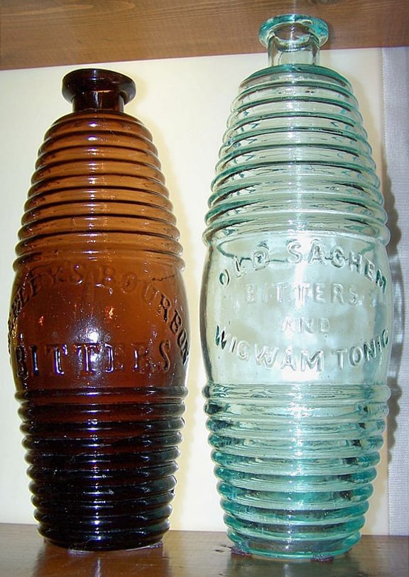
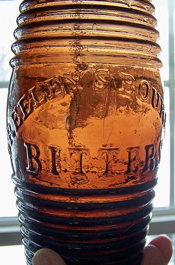
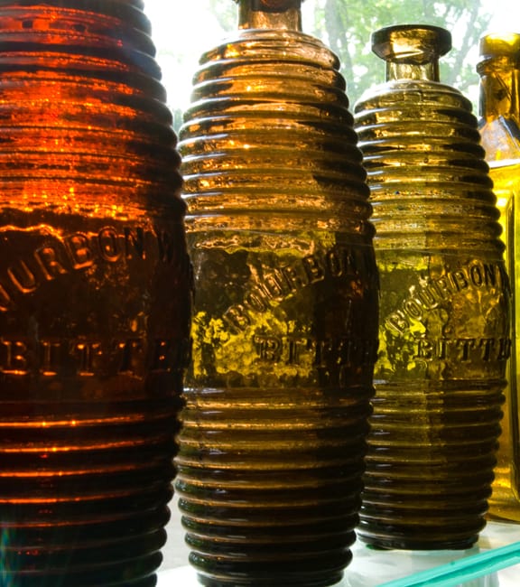
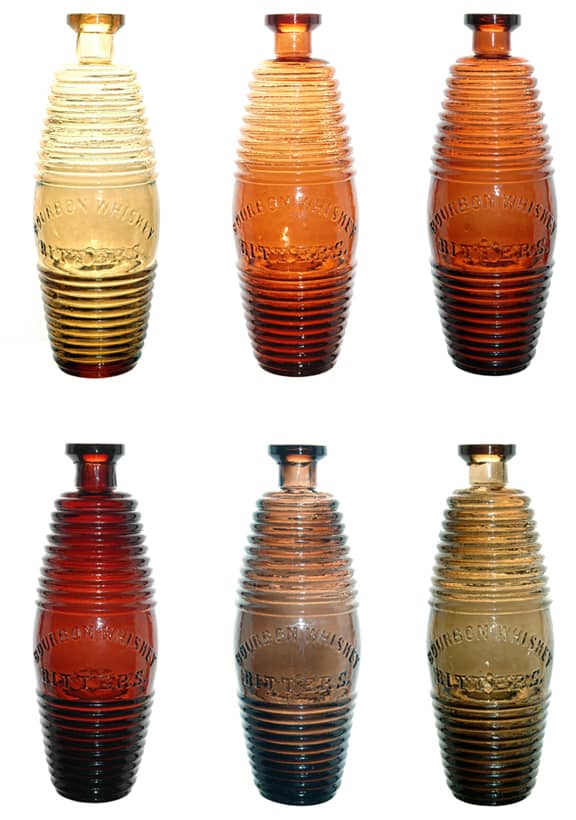
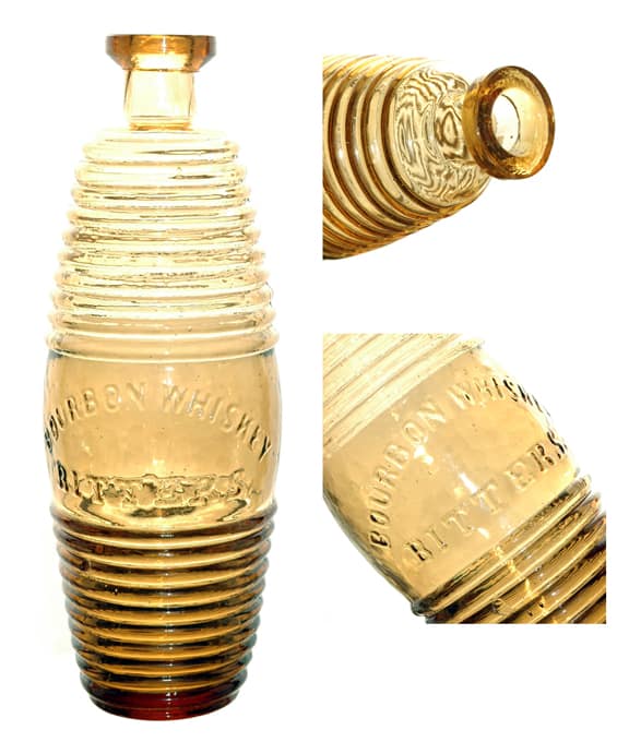
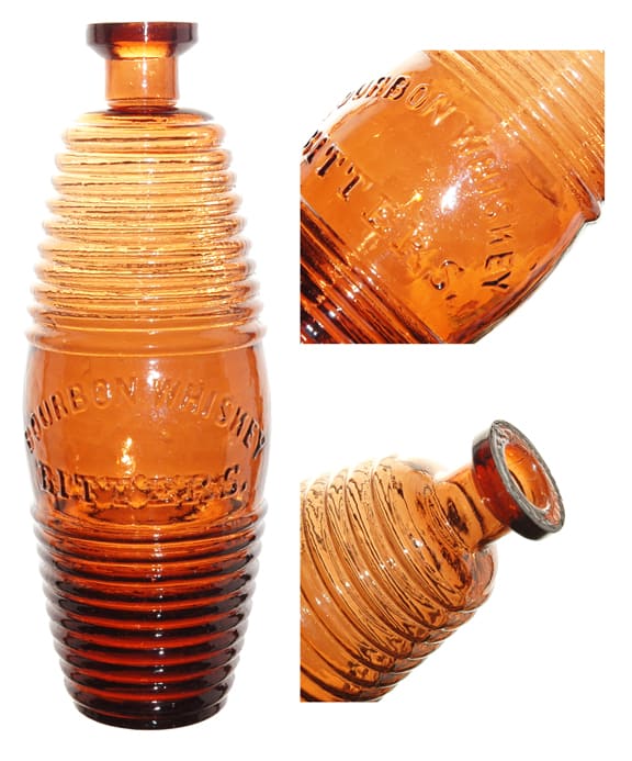
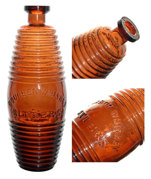
Peach colored Bourbon Whiskey Bitters added to Color Run

Peach colored Bourbon Whiskey Bitters added to Color Run

BourbonWhiskeyBitters_GreenMountainFreeman1860

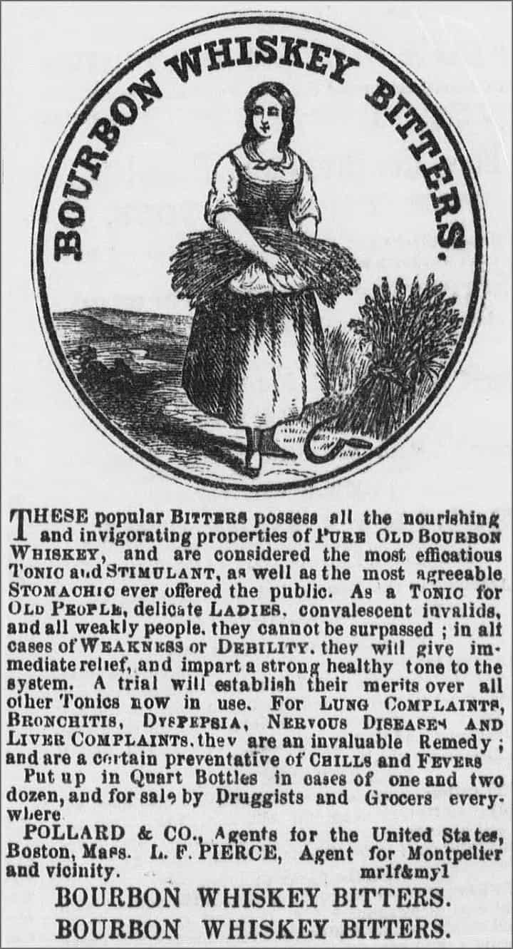
Bourbon Whiskey Bitters advertisement – Green Mountain Freeman (Montpelier, Vermont) March 8, 1860

12 February 2012 (R•110214 update with advertisement above)

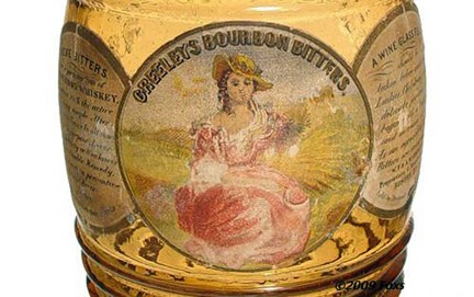
Apple-Touch-IconAYesterday I completed photography for two (2) new peachy coppery barrels that will join my run of  the popular figural barrel form of the Bourbon Whiskey Bitters. It is rather difficult to put together a distinct color run as the barrels are usually in muddier, similar chameleon tones. The Carlyn Ring and W.C. Ham listing in Bitters Bottles is as follows:

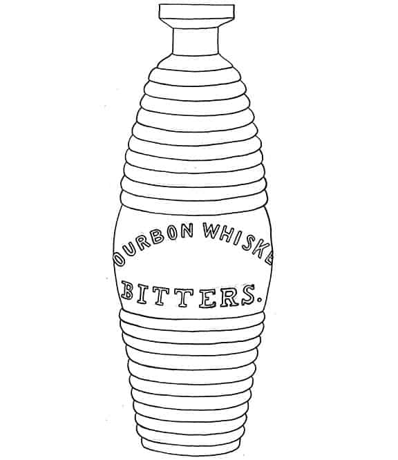
B171sketch

B 171  BOURBON WHISKEY BITTERS, Circa 1860’s – 1880’s
BOURBON WHISKEY ( au ) / BITTERS. // c // Pollard & Company Boston
9 1/4 x 2 7/8 (4 1/4)
Barrel, 10-10, FM, Applied mouth, Aqua – Extremely rare; Amber – Very rare;
Puce, Strawberry, and Plum – Common

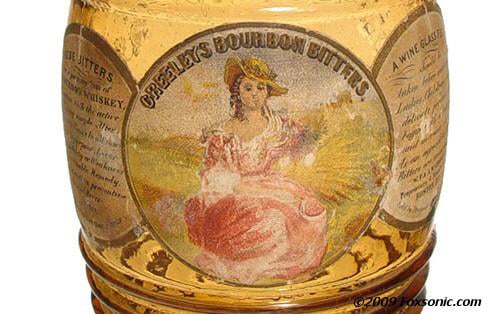
Label: Three overlapping circles

Image of three overlapping circles for similar Greeley’s Bourbon Bitters

Left Circle: These bitters prepared of pure old Bourbon Whiskey and possess all its stimulating tonic and medicinal power. Modified and improved in its action on the system by the addition of many simple alternative and bitter tonics making them invaluable. A remedy in the treatment of lung complaints, bronchitis, dyspepsia, liver complaints and general debility and weakness of the system.

Center Circle: Bourbon Whiskey Bitters,

Right Circle: A wine glassful should be taken before each meal. Ladies and children should begin with less quantity and increase. As an agreeable stomachic these bitters are unsurpassed.

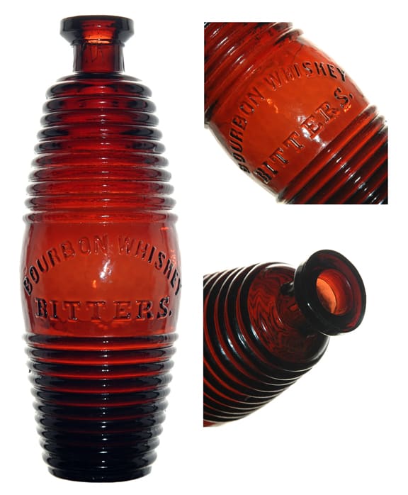
B 171 | BOURBON WHISKEY BITTERS – Meyer Collection

BOURBON WHISKEY BITTERS in a reddish puce – Meyer Collection

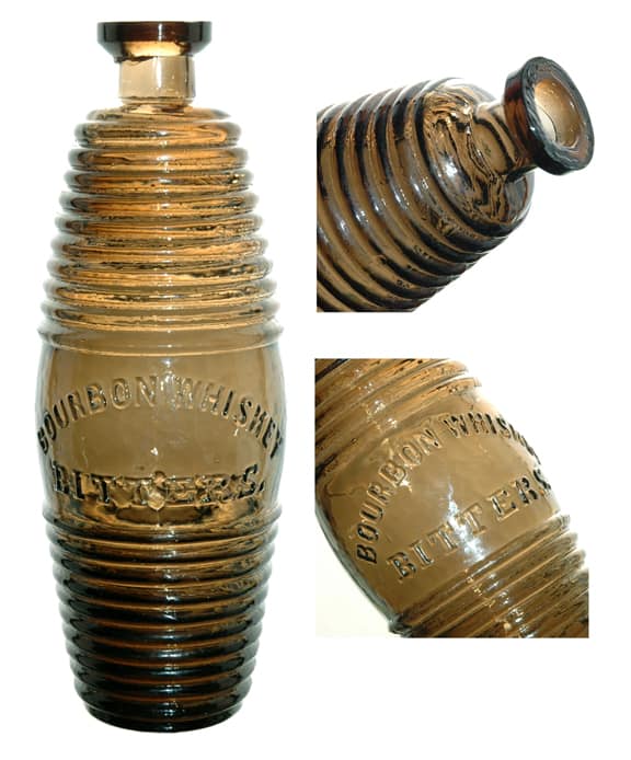
BOURBON WHISKEY BITTERS in a pewter coloration – Meyer Collection

BOURBON WHISKEY BITTERS in a natural grape juice color – Meyer Collection

BOURBON WHISKEY BITTERS in a light straw yellow color – Meyer Collection

BOURBON WHISKEY BITTERS in a light peach copper color – Meyer Collection

BOURBON WHISKEY BITTERS in a medium peach copper color – Meyer Collection

Read more:

Greeley’s Bourbon Bitters – A Great Boston Bitters Barrel

Greeley’s Bourbon Whiskey Bitters – aka Vertical Greeley’s

Posted in Advertising, Bitters, Bourbon, Collectors & Collections, Color Runs, Figural Bottles | Tagged , , , , , , | Leave a comment

Kalamazoo Celery Pepsin Bitters – Get Some for (from) your Wife

This is why I collect Bitters.

Today I started my photography of  bottles obtained in 2011. I usually do this in the winter when the light and sun is just right. Well, I’m cataloging an unlisted labeled bitters which I believe is a Kalamazoo Celery Pepsin Bitters (I had to improvise and make up a Ring | Ham number. There is a clear square (K 6L) that is a square ladies leg. Anyway get a load of this testimonial from a Mr. O.B. Joyful from Klondyke, Alaska for the product…

Testimonial: Sleepy Slope, Klondyke, Alaska, The P. L. Abbey Co., Kalamazoo, Mich,

Gentlemen: I wish to say in regards to your Kalamazoo Celery Pepsin Bitters that they have restored me and my wife to complete happiness. For five years my wife was so nervous that I could not sleep with her. She took three bottles of your Celery Pepsin Bitters and now anyone can sleep with her. She is as quiet as a kitten.

Respectfully, O. B. Joyful

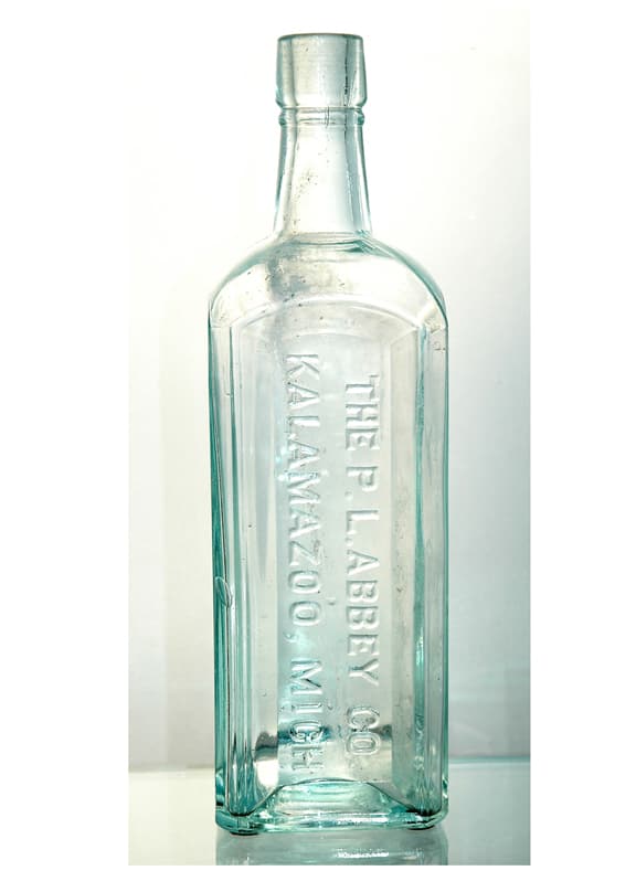
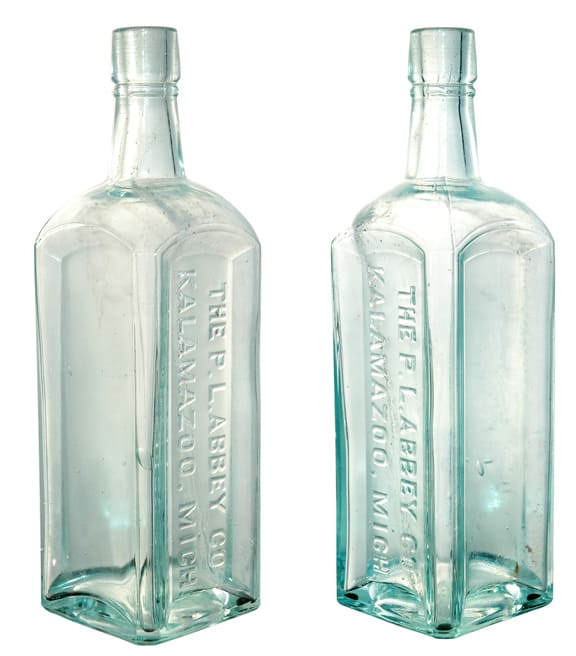
K 6.5L  KALAMAZOO CELERY PEPSIN BITTERS
L…Kalamazoo Celery Pepsin Bitters
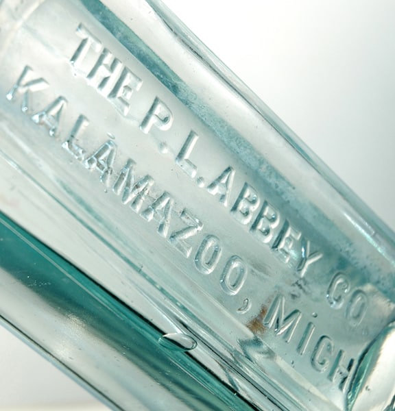
// b // THE P. L. ABBEY CO / KALAMAZOO / MICH
8 3/4 x 2 5/8 x 2 1/4
Square, Aqua, Tooled Top

Label: Indispensable to settle stomach after alcoholic excesses, Pure extract Kalamazoo Celery is used in the p[reparation.

Testimonial: Sleepy Slope, Klondyke, Alaska, The P. L. Abbey Co., Kalamazoo, Mich,

Gentlemen: I wish to say in regards to your Kalamazoo Celery Pepsin Bitters that they have restored me and my wife to complete happiness. For five years my wife was so nervous that I could not sleep with her. She took three bottles of your Celery Pepsin Bitters and now anyone can sleep with her. She is as quiet as a kitten.

Respectfully, O. B. Joyful

Trademark No. 4719 Dated February, 1886: Perley L. Abbey & W.C. Tuthill

Kalamazoo Celery Pepsin Bitters - Meyer Collection

Kalamazoo Celery Pepsin Bitters - Meyer Collection

Kalamazoo Celery Pepsin Bitters detail - Meyer Collection

Posted in Bitters, Humor - Lighter Side | Tagged , , , , | Leave a comment

Dr. Wonser’s U.S.A. Indian Root Bitters – Looking at Some Information and Colors

Dr. Wonser’s U.S.A. Indian Root Bitters – Looking at Some Information and Colors

10 February 2012 (R•052914) (R•101714)

Wonsers_BB

Two Dr. Wonser’s in the famous John Feldmann collection in Amityville, NY

Apple-Touch-IconAOne of my favorite Bitters bottles and certainly one of the very top western Bitters bottles is the Dr. Wonser’s U.S.A. Indian Root Bitters. You virtually never see these heavily embossed bottles outside of the western shows or western auction houses such as American Bottle Auctions. Just about every great example resides in western collections though I am aware of a few in eastern collections and I possess one here in Texas which is pictured below. Most of the information has been posted on Western Bitters News by Warren Friedrich, Rick Simi and Dale Mlasko. There are two (2) great bottles posted on Western Bitters News now (red amber and blue aqua) by Millers Extra.


W146Wonsers

Dr. Wonser’s U.S.A. Indian Root Bitters label – image from Bill Ham

I will use this opportunity to post pictures of this wonderful bottle and relay information from western collectors and researchers, Warren Friedrich, Rick Simi and Michael Dolcini. This will also give us the opportunity to look at a number of bottle colors in one post and the great curved ‘R’s. Also look at the applied mouth differences in the aqua examples.

“This great remedy strikes at the root of every disease”

Trade Mark and Name Application for Dr. Wonser’s U.S.A. Indian Root Bitters – image by Michael Dolcini

W 146  DR. WONSER’S INDIAN ROOT BITTERS,

DR. WONSER’S ( au ) / U.S.A. / INDIAN ROOT / BITTERS // c //
L…Dr. I.H. Wonser’s U.S.A. Indian Root Bitters, Distributor and Manufacturers, San Francisco
11 1/2 x 3 (5 1/2) LTC, Applied mouth, Amber (Yellow to Olive amber), Rare; Green,
Extremely rare. 10 1/2 x 3 (5 1/2) CM, Deep kick-up, Aqua, Applied mouth, Rare
Sixteen flutes on shoulder, two rings on neck.

Note 1: The green colored example is considered one of the top Western Bitters.
Green examples have been dug in Auburn and Petaluma, California.
Broken green examples have been dug on the California-Nevada border
and in Carson City, Nevada. A number of undamaged and many broken
examples were dug in Virginia City, Nevada in 1998.

Note 2: Variation in height could be misleading. Other measurements
indicate both bottles could have been blown in the same mold.
San Francisco Chronicle August 8, 1871.

Dr. Wonser’s Indian Root Bitters Advertisements – Warren Friedrich

[From Warren Friedrich at Western Bitters News] In researching this bitters product, I came across two interesting advertisements. The bottom ad is the earliest I’ve found for this product. The ad was placed in The Gilroy Advocate paper and ran from June 25th, 1870 for 3 mos. Notice that the manufactory and depot for this bitters was at 645 Third Street, S.F. He was not at this address very long, as the upper ad indicates by December 17th, 1870 he had relocated to 418 Sacramento St. The upper ad was placed in the San Francisco Daily Examiner on December 17th, 1870 and ran for 1 month.

The time frame that his product is being marketed is interesting as San Francisco Glass Works had not begun operations at their rebuilt facility until September 12th, 1870. The lettering style is the same as the earlier large lettered Renz’s bitters bottle, both bottles probably made by the same pattern maker.

The bottle itself is interesting in that it has been made in two variations. Both are the amber colored examples. One variant has a configured base with sharp edge and a stepped ledge going into a concave circle with small center dot. The more often seen variant has a rounded edge base with a semi-shallow kick up with center dot, the aqua examples also share this mould feature. I do not consider the different style tops to be a variant, this is just a difference of lipping tools used for the completion of the mouth.

[From Rick Simi at Western Bitters NewsDr. Wonser’s U. S. A. Indian Root Bitters was first advertised in The Gilroy Advocate newspaper on June 25th, 1870, the advertisement ran for 3 mos in this paper. The manufactory and depot for this product was located at 645 Third St., San Francisco.

Wm. Hawkins displays seven dozen of his U. S. A. Indian Root Bitters at the San Francisco Fair on September 1st, 1870.

Hawkins placed a second advertisement (in a different style format) in the San Francisco Daily Examiner newspaper on December 17th, 1870, this ad ran for 1 month. The location of his manufactory and depot was now located at 418 Sacramento St., San Francisco.

W. M. Hawkins applied for the trademark name of his bitters on June 3rd, 1871, this was reported in the Sacramento Daily Union newspaper on June 5th. [see post of June 21, 2009 by Old Cutters for photocopies of the trademarked application].

Again Hawkins entered his Wonser’s U. S. A. Indian Root Bitters in the 1871 State Fair and on September 25th, 1871 received a diploma award. Another advertisement appeared in the Wine Dealers Gazette, a monthly publication in the December 1871 issue. The advertisement stated

“This great remedy strikes at the root of every disease, which lies in the liver and the blood. They are not like the many poisonous compounds with which the country is flooded, under the name of Bitters, which are made of refined poison and gall, and seasoned up to suit the taste. They contain no alcohol, and their effects do not die out, but on the contrary are lasting and beneficial. For Piles, Constitpation, Chronic Coughs, Dyspepsia, Fever and Ague, Kidney, all Billious and Most Chronic Diseases”.

[From Michael DolciniHere is the claim of California Trade Mark for the USA Indian Root Bitters. Notice that Hawkins’ claim is for “Liquid Bitters” and “Dr J. Wonser’s” on the same day 03 June 1871. He was completely covering the bases (see below).

Trade Mark and Name Application for “Dr. J.W. Wonser’s U.S.A. Indian Root Bitters” – image by Michael Dolcini

Trade Mark and Name Application for “Liquid Bitters” with capital “U.S.A.” letters – image by Michael Dolcini

W146_Wondser_green_BBS

Dr. Wonser’s Indian Root Bitters in a pure green – Bitters Bottles Supplement

Dr. Wonser’s Indian Root Bitters in a lighter than normal amber coloration (ex: Grapentine) – Meyer Collection

Dr. Wonser’s Indian Root Bitters in amber – American Bottle Auctions

Dr. Wonser’s Indian Root Bitters in a deep red amber – Millers Extra

Dr. Wonser’s Indian Root Bitters in a yellow green color

Dr. Wonser’s Indian Root Bitters in blue aqua – Millers Extra

Dr. Wonser’s Indian Root Bitters trio in amber, olive green and blue aqua – Robert Frank (courtesy ABA)

Dr. Wonser’s Indian Root Bitters in olive green – Millers Extra

Embossing detail of a Dr. Wonser’s Indian Root Bitters in olive green – Millers Extra

Three gorgeous Dr. Wonser’s Indian Root Bitters – Dave Kyle

Posted in Bitters, Collectors & Collections, Ephemera, History | Tagged , , , , , , , , , | 2 Comments

Benicia Iridescence and Patina on Bottles – Not a Sick Bottle

Benicia Iridescence and Patina on Bottles – Not a Sick Bottle

09 February 2012 (R•041614)

Apple-Touch-IconAI wanted to start a collection of pictures of bottles with Benicia iridescence and/or patina. Please send me examples of bottles you have or pictures in your archives.

I asked prominent West coast collector Mike Dolcini for some pictures of sick bottles from his extensive background of material that he has collected, found or dug and his response was “DUDE, that isn’t sick, it’s that beautiful “Benicia” iridescence. You never remove that. Some collectors pay a premium for it”.

This made me smile. Of course I know that the bottles are not sick but I suppose in my email haste I used the term ‘sick’ thinking it sufficed for the tough to spell words “Benicia”, iridescence and patina.

You know, when I woke up as a child and was green or purple, and my runny nose was crusted up, my mom thought I was sick?

“DUDE, that isn’t sick, it’s that beautiful “Benicia” iridescence. You never remove that. Some collectors pay a premium for it”.

Glass Beach is an unusual beach in Benicia, California that is abundant in Sea glass created from years of dumping garbage into an area of the coastline. It is located at the 12th Street Park – Wikipedia

Photos of pieces of sea glass which has this “benicia iridescence” even though they have been worn by the sea. Perhaps they obtained this patina after, and not during active tumbling in the ocean…Clyde Smith, Canada

SOUTHWICK & TUPPER NEW YORK. Here’s an example of Benicia glass at its best. Colors range from bright red to beautiful greens and blues – American Bottle Auctions

The Original Pocahontas bitters bottle (Y. Ferguson) is a rare bitters that always appears as aqua. The one is covered in a Benicia film and “any way you look at it, it’s a very gorgeous bottle,” says Jeff Wichmann. “We can say without any hesitation that this is the finest Benicia bottle we’ve ever offered.” (American Bottle Auctions)

B & C SAN FRANCISCO soda – Brett Weathersbee

B & C SAN FRANCISCO soda – Brett Weathersbee

From the Holy Land, Roman glass tear bottle with golden patina “Iridescence” Nicely made in a globular body with a long cylindrical neck and a rim folded outwards. Dated from, 100 – 300 AD

Nice photograph of dirty or ‘sick’ bottles that are gorgeous

Encrusted old bottle

PAINE’S CELERY COMPOUND and fruit jars with character

Many years of corrosive action and mineral build-up

ROGERS NURSERY HAIR LOTION This is very unique bottle due to the beautiful rainbow iridescence “patina” from a rare “positive” interaction with soil this bottle was buried in. courtesy High Desert Historic Bottle Web Site

From the Holy Land, Roman glass tear bottle with golden patina “Iridescence” Nicely made in a globular body with a long cylindrical neck and a rim folded outwards. Dated from, 100 – 300 AD

Roman gold and silver patina bottle

A Crimean War glass bottle with fine Iridescence, 1853-56. The club shaped bottle of quite heavy glass with molded inscription reading R. ELLIS PUTHIN/MANUFACTURED/ON SUPERIOR/AERATED WATERS/TO THE ROYAL FAMILY. The bottle apparently discarded by British troops during the war. Found in the Crimea. 8.25″. The entire surface covered with beautiful frosty peacock iridescence better than on most examples of ancient glass. A gem with an interesting historical context. Edgar L. Owen Ltd

Roman Glass Perfume Bottle Eastern Mediterranean Early Mid 1st Century. Light aquamarine glass, thick, transparent. Broad piriform body with slightly flattened base; Tubular neck with tooled angle at bottom; disc-like rim with fold on top, pressed flat. Two tooling-marks round body. Remains of dark crust and some iridescence.

Another still life of these great character bottles

Pickle dug by Lauren Bottone

Beautiful bottle top dug by Lauren Bottone

Berry bottle – Mike Holzwarth

Continental onion and mallet shaped bottles – David Walker Barker

An extremely rare Mini early English Wine bottle with beautifull iridescence – eBay

Very light colored pontilled DR. WISTARS BALSAM OF WILD CHERRY Benicia dug bottle. Colors are salmon red, yellow and green. – Dennis Rogers

Quick shot of some of my favorite “not sick” glass for your gallery. Headless sided cobalt soda is a Coon & Spencer Nectarian from New York. – Andy (Goldfrank)

EagleSuperiorSodaWaterGWA_patina

“W. EAGLE’S / SUPERIOR / SODA OR MINERAL / WATERS – W.E.”, New York, ca. 1845 – 1860, cobalt blue with an overall metallic patina, 7 1/8”h, iron pontil, applied mouth. An old 3/8” by 1/4” chip is off the side at the base and a faint ice pick bruise is on the very inside edge of the lip. Curt Paget Collection. – Glass Works Auctions

VonthofensSchnapps_GWA101_patina

“VONTHOFEN’S – AROMATIC – SCHIEDAM / SCHNAPPS”, (Denzin, VON-21), American, ca. 1850 – 1865, blue green, 9 3/4”h, iron pontil, applied double collar mouth. Curt Paget Collection. – Glass Works Auctions

Posted in Advice, Ancient Glass, Digging and Finding, History, Questions, Sea Glass | Tagged , , , , , , , , , , , , , , , , , , , , | 2 Comments

Glass Works and Glass Factories – Hell on Earth?

Clyde Glass Factory – submitted by Rick DeMarsh

To a little sand, a little alkali, and a little limestone, add considerable heat and a still greater amount of skill, might be taken as a brief recipe for the manufacture of a glass bottle.

Popular Science Monthly/Volume 36/December 1889/Glass-Making III

Glass Works and Glass Factories – Hell on Earth?

08 February 2012

Yesterday I did a post titled “Boys in Glass Houses – Taking on the Mannerisms of Men” that left me wondering about the factories and glass works that the lads worked in. There are a surprisingly few pictures and resources of these dark, hot and dirty environments. I suppose that taking pictures of factories were not consider vogue or as architectural wonders worthy of documentation. Anyway, here are some pictures that I found.

As we see and identify the iconic cooling towers of a Nuclear Power Plant from afar we can surely suspect that persons approaching the vicinity of a glass factory could identify the smokestacks and oven towers of the glass works, even without the smoke that must have been constant.

“Am afraid that it makes me a little sad, if not a tad guilty, elevating these orbs of ours to such an elevated position when so many were “born” of such dark, hot, filthy, unhappy circumstances, conditions.”

Jeff (Froggy) Burkhardt

Whitney Glassworks-Glassboro, New Jersey

View of Sandwich Glassworks – circa 1835

Graham Glass Works – circa 1931

A rare photo of Smethport “Town Hill” showing two glass factories and the surrounding Smethport, PA. region (Camp Glass Company factory on right with smokestack and Smethport Bottling Company on left)

Whitall Tatum Glass Factory – Southern New, Jersey

Seneca Glass Company Factory Ovens

The Manitoba Glass Works Historic Site is the site of the first glass container factory in Western Canada. It was built in 1906 by Joseph Keilback and his partners. Glass-blowers from Poland and the United States, aided by local labor, used silica sands to produce bottles for breweries and soft drink companies in Winnipeg, which served the prairie market. Semi-automatic machines were soon installed to increase production. Winnipeg businessmen took over and enlarged the plant between 1909 and 1911. The new company expanded its production to include jars, medicine and ink bottles. At its peak it employed 350 workers.

T. W. Dyott’s Glass Works at Richmond & Beach, as seen from the Delaware River, 1831

View of the Glass works of T. W. Dyott at Kensington on the Delaware nr Philada., Lithograph by Kennedy & Lucas after William L. Breton, 1831. (The Library Company of Philadelphia)

Glass works of T.W. Dyott – Philadelphia

Coshocton Glass Works – (1911)

Acme Glass Works, Steubenville, Ohio

The Smethwick Glass Works of Chance Brothers, West Midlands

Glass Factory – Okmulgee, Oklahoma

1899 Appert Glass Company (In 1901 consolidated into Mississippi Glass Company ) Port Allegany, Pennsylvania

Schram Glass Factory

To a little sand, a little alkali, and a little limestone, add considerable heat and a still greater amount of skill, might be taken as a brief recipe for the manufacture of a glass bottle.

Remains of Clevenger Brothers Glass Works

Chelmsford Glass Works Long House (Lowell, Mass), 139-141 Baldwin Street, ca. 1820, National Register of Historic Places, The Chelmsford Glass Works Long House is the only remaining example of housing erected by the company for its workers. Located in what was once part of Chelmsford, the glass works was established in 1802 and was one of the earliest industries in the area. At its peak, the company employed members from about twenty families with most of the skilled workers being German immigrants.

Illinois Glass Co, Alton, Illinois…Early 1900’s – courtesy Dave Hall

Photograph of an exterior view of the Pacific Coast Glass Works (approx: 1902 – 1928), showing earthquake damage, San Francisco, 1906. The large, wooden buildings stands across the wide street at center with its right side demolished by the earthquake. The front wall on the right side has shifted and is now gently leans on the remaining walls. The roof is broken into large slabs and the interior walls have crumbled and spilled through the right side. The electrical poles which stand along the right side of the building still stand while piles of debris crowd their bases. Two pieces of wood stand upright in the dirt road in the foreground.

Fostoria Glass Works Postcard (Moundsville, West Virginia)

Workers in front of Ellenville Glass Factory, New York circa 1853.

Libbey Glass Works – Toledo, Ohio

View of the American Flint Glass Works, South Boston, from the harbor. (1853)

Posted in Glass Companies & Works, Glass Makers, History | Tagged , , , , , , , , , , , , , , , , , , , , , , , , | Leave a comment

Boys in Glass Houses – Taking on the Mannerisms of Men

Boys in Glass Houses – Taking on the Mannerisms of Men

07 February 2012 (R•090115)

Apple-Touch-IconAAs I sometimes contently watch my grandson Nicholas (9 years old this month) playing his video games, riding his ATV and taking on the challenges of school and growing up, I remember that our country has made great strides in child labor laws and it wasn’t too long ago that children had many more responsibilities than they do today.

boys taking on the mannerisms of men”

In researching glass houses and factories, I am astounded by the working conditions that these young lads and lasses had to endure. I also smile inwardly, but with trepidation, that most children don’t even understand the concept of working. Even Nicholas tires after 15 minutes of yard work!
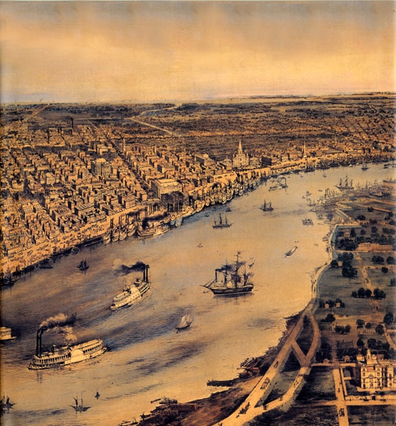
I’ve posted some pictures and information to support my point.

As the US industrialized, factory owners hired young workers for a variety of tasks. Especially in textile mills, mines and glass factories, children were often hired together with their parents. Many families depended on the children’s labor to make enough money for necessities.

Like other developed countries, the United States has labor laws that protect children from being exploited in the workplace. But this has not always been the case.

In the 19th and early 20th centuries, children were seen as a cheap labor source, and to help out their families financially, many children were forced to work in factories, mines, and elsewhere, under dirty and dangerous conditions, for very low wages.

The National Child Labor Committee, an organization dedicated to the abolition of all child labor, was formed in 1904. By publishing information on the lives and working conditions of young workers, it helped to mobilize popular support for state-level child labor laws. These laws were often paired with compulsory education laws which were designed to keep children in school and out of the paid labor market until a specified age (usually 12, 14, or 16 years.)

“these are not GAP Kids”

In 1914 the Arkansas State Federation of Labor placed a child welfare initiative on the ballot prohibiting child labor, which the voters passed.

In 1916, the NCLC and the National Consumers League successfully pressured the US Congress to pass the Keating-Owen Act, the first federal child labor law. However, the US Supreme Court struck down the law two years later in Hammer v. Dagenhart (1918), declaring that the law violated a child’s right to contract his or her own labor. In 1924, Congress attempted to pass a constitutional amendment that would authorize a national child labor law. This measure was blocked, and the bill was eventually dropped.

It took the Great Depression to end child labor nationwide; adults had become so desperate for jobs that they would work for the same wage as children In 1938, President Franklin D. Roosevelt signed the Fair Labor Standards Act, which, among other things, placed limits on many forms of child labor.

Even my design studio in downtown Houston, was at one time the Texas and then Eller Wagon Works. The companies originally occupying our building built Transport Tank Wagons and Carriages prior to the automobile and truck industry. The completed wagons would be loaded on rail cars in from of our building on Commerce Street and shipped to their final order destination. The working conditions in our building were crude at best. Some of our historic pictures of our space are amazing. See FMG Studio Tour

Texas Wagon Works Building – Where my FMG Design studio is located

“I’ve posted somer pictures and information to support my point”

Whitney Glassworks – Glassboro, New Jersey

1910 photograph by Lewis W. Hine. The photo was taken in regards to Child Labor Laws, you can see these boys taking on the mannerisms of men.

Wheaton Glass Works – Millville, New Jersey (I like that bench set-up!)

November 1909. Blowing bottles. Night shift at the Cumberland Glass Works in Bridgeton, New Jersey.

June 1911. Alexandria, Virginia. “Old Dominion Glass Co. A few of the young boys working on the night shift at the Alexandria glass factory. Negroes work side by side with the white workers.” Photograph by Lewis Wickes Hine.

A mixed group of ethnic workers and age groups working with glass.

At Indiana glassworks at midnight, August 1908

9:00 pm at Indiana Glass Works, nearing the end of a long day – National Archives

Carrying-In boy, one of the young workers in a glass factory. Alexandria, Virginia

After a long day, a group of boys going home from the Monougah Glass Works At 5 p.m. One boy remarked, “De place is lousey wid kids.” Fairmont, West Virginia.

Glass blower, gaffers and mold boy in a West Virginia glass factory in 1908

Early Glass Blowing in South Jersey

Glass blowing at Crescent Glass Works

Early Glassblowing Illustration

Blowing a Demijohn

I love this picture of a large glass cylinder being fired

15-year-old “carrying-in” boy at the Lehr Glass Works, October 1908

The Factory: Day scene. Wheaton Glass Works. Millville, New Jersey.

A child after putting in a long day. These are not ‘GAP’ kids

Glass Blowing at the Glass Works – Pittsburgh, PA.

Image of late 19th century trade card showing glassblowers at work

Six black workers in the Alexandria (Va.) Glass Factory.” Lewis Hine, photographer.

Circa 1910 glass factory in Charleroi, a town founded by Belgium and French immigrants along the Monongahela River in Southwestern Pennsylvania in 1890.

Photograph of children working in a bottle factory, Indianapolis, Indiana

New Jersey Glass Factory, c. 1900, Collection of the Museum of American Glass

Original TC Wheaton Factory, 1888, Collection of the Museum of American Glass

Glass bottle production. Historical artwork of children working alongside adults in a glass bottle factory. The glass is heated by the furnace (right) until it is molten, then the hot glowing glass is blown and moulded (centre right) into a bottle. Image taken from Grands Hommes et Grands Faits de l’Industrie (Great Men and Great Facts of Industry), France, circa 1880.

Lunch time at Economy Glass Works in Morgantown, West Virginia

Blowing bottles at Fostoria Glass Works in Moundsville, West Virginia

16 year old on night shift, glass works factory, 1908, Lewis Hine

DemijohnsFrance

Women with Demijohns

Posted in Glass Companies & Works, Glass Makers, History, Photography, Technology | Tagged , , , , , , , , , , , , , , , , | 6 Comments

Warm Sunshine and Glass Photographs from Mike Holzwarth

Nothing like some sun on glass to warm us up in February. Photos shared by Mike Holzwarth – Bottles he has dug over the years. This is a photo album that I will add to as Mike keeps adding pictures.

Read further: A Nice Group of Pictures from a Collector in Ft. Collins, Colorado

Posted in Collectors & Collections, Inks, Insulators, Photography | Tagged , , , , | Leave a comment

Bunker Hill Monument Figural Colognes

Bunker Hill Monument Figural Colognes

05 February 2012 (R•111215) (R•022319)

Apple-Touch-IconAYesterday I spent the day recording and moving some new bottle acquisitions around. One bottle that was a conversation piece on facebook was my new citron, SKILTON, FOOTE & COMPANY BUNKER HILL PICKLES / TRADE MARK, (Motif of monument) that I won in the Heckler | Thomas McCandless Auction III. This bottle will join my color run of lighthouses pictured above.

The second bottle was a short, square (have not seen a square Bunker Hill before) yellow/amber BUNKER HILL BRAND SKILTON, FOOTE & COMPANY BUNKER HILL PICKLES / TRADE MARK, (Motif of monument) that I purchased at the 49er Bottle Show in Auburn, California this past December. The Heckler bottle was made in the form of the Cape May Lighthouse built in 1859 at Cape May, New Jersey. This is a great bottle in my mind because of the dual Cape May Lighthouse form and and Bunker Hill Monument embossing. This got me thinking of my Monument Colognes and specifically the Bunker Hill reference.


The first battle of the Revolutionary War was fought on June 17th, 1775, at Bunker Hill during the Siege of Boston. When the war began, the British knew the importance of the city of Boston to the American colonists and wanted to gain control of it early on. Across the Charles River, in Boston, stood two hills on the Charlestown Peninsula – Breed’s Hill and Bunker Hill. 1500 American colonists were sent to establish defensive positions on Bunker Hill. In the space of just two hours, 2,500 British soldiers charged the Colonial patriots (rebels) three separate times. Fighting from V-shaped trenches hastily built overnight, the Colonial forces drove back the first two attacks causing heavy losses. On the third attempt, the British commander ordered a bayonet charge to seize Breed’s Hill. Many of the American militias, lacking bayonets on the their muskets and running short of ammunition, were forced to fall back to their fortified position in Cambridge. The British controlled Bunker Hill.

The American Colonists sustained their greatest number of casualties while in retreat on Bunker Hill. The British army suffered even more casualties, though – forty percent of their forces, including officers, were lost. Great Britain had won the first important battle of the war. The American troops, however, had learned that the British army was not invincible in traditional warfare. The Battle of Bunker Hill became a symbol of national pride and a rallying-point of the rebellion against British rule.

Battle of Bunker Hill Illustration by John Mackenzie 2009

In researching Monument Colognes I came across a really great article previously published in Antique Bottle and Glass Collector by Harold Leonard Krevolin under the previous tenure of Glass Works Auctions Jim Hagenbuch. Antique Bottle and Glass Collector is now published by John Pastor of American Glass Gallery. I have reprinted it below as it really answers the many questions we have about this bottle.

FIGURING OUT FIGURAL BOTTLES

By Harold Leonard Krevolin

THE BUNKER HILL MONUMENT FIGURALS: ARE THEY OR AREN’T THEY?

INTRODUCTION

This article has two purposes. The first is to explore the various sources of information to see what figural, if any, represent the Bunker Hill Monument in Charlestown, Massachusetts. The other is to help the reader to become better acquainted with these bottles. While there is an abundance of information on the monument the same is not true of the figurals. This situation provided the writer with the motivation to fill this gap.

As a beginning, data was obtained from the National Park Service, United States Department of the Interior, Boston National Historical Park, Chalestown Navy Yard, Boston (Charlestown), Massachusetts. The materials were helpful in becoming informed about the monument and its history. The information was studied and compared with the figurals; this started some initial thinking about the relationship between the bottles and the monument.

Bunker Hill Monument – National Park Service, Richard Frear photo.

The next step was a trip to Charlestown to study the 221 foot 5 inches tall structure firsthand. This provided the opportunity to answer questions not in the materials sent by the Department of the Interior and other sources. It offered the opportunity to get a better grasp of its structural make-up and aesthetic characteristics. It was discovered later in the investigation that this close scrutiny of the monument was invaluable as it and the bottles were being compared.

It is interesting to note the dichotomy that exists, in calling the figurals Bunker Hill Monument and monument colognes or just monuments. As far back as 1926 with Stephen Van Rensselaer’s Early American Bottles and Flasks, (J. Edmund Edwards, Publisher) and more recently Helen McKearin and Kenneth M. Wilson’s American Bottles and Flasks and Their Ancestry (1978) (Crown Publisher, Inc.), there is no reference to the figurals as the Bunker Hill Monument. This is also evident in auction catalogues from such sources as Glass Works Auctions, Harmer Rooke Galeries, and Robert W. Skinners, Inc., and others. As a sidelight, there is a lack of consistency in the bottle periodicals during the 1960’s to the present. At times, the bottles are referred to as monuments and other times Bunker Hill Monuments.

In contrast, there is a sampling of books that use the words Bunker Hill Monument or just Bunker Hill to describe these figurals. This occurred as early as 1949 in E. McCamly Belnap’s Milk Glass (Crown Publishers, Inc.), Otha D. Wearin’s Statues That Pour – The Story of Character Bottles (1965) (Wallace Homestead Book Company), Jewel and Arthur Umberger’s Collectible Character Bottles (1969) (Corker Book Company), and Cecil Munsey’s The Illustrated Guide to Collecting Bottles (1970) (Hawthorn Books, Inc.). This contradictory situation simply points to the lack of certainty about what these figurals should be called. This was recently pointed out when a well-known auction catalogue that included bottles, flasks, and inks called the figural and Baltimore Monument Cologne. (Note: No auction houses previously cited) Through an examination of the evidence, a more definitive conclusive will arise.

In order to determine whether the figurals are or are not the Bunker Hill Monument, a progression of information and reaction has been developed. First, the reader will be given a detailed description of the figurals. This will assist in arriving at a better understanding of the figurals whether the answer to this article’s question is “yes”, “no” or even “maybe”.

The next section will deal with the reaction to the figurals’ descriptions as related to the monument. Certain significant descriptive elements will be used to make the comparisons. These will include closure, surface, windows, date, and origin.

From this discussion a two-part conclusion will be offered. The first will answer the article’s question. The second will give a review of the bottles, as figurals with no attempt to relate them to the Bunker Hill Monument. This is important since a figural must stand on its own value to be collectible or saleable.

Finally, in keeping with the format or articles in this column, a value scale will be presented for those figurals that are known to exist. The listing is comprehensive and as new examples surface they can be easily put in the scale. It is felt that any new bottles that will affect value will have to do with color. For example, if a yellow or red example were found one could be sure they would be at least rare or very scarce. The possibility of an aqua being found is not far fetched. Depending on circumstances, it could be quite low. When unusual color is not a consideration, other factors such as rarity and quality of glass need to be considered.

DESCRIPTION OF BOTTLES

Shape

The bottle is in the shape of a partial obelisk with a square base. The four-sided shaft that has tapered ends on the top with the bottle’s rounded neck and opening. A completed obelisk should have the four tapered sides ending with a pyramidal point on its top.

Size

There are two basic size groupings. The first group includes the largest that are approximately twelve inches in height and have a square base that is close to two and one-half inches. Those with obelisk glass stoppers are about fourteen and one-half inches tall.

The other group range in height from slightly over five to nearly ten inches. Like the larger size, the bases are square, but are not as uniform in size since their heights vary. Some examples of height in this group are: clear – 5 1/8, 6 3/8, 8, 9 1/4, 9 7/8; white milk glass – 6 1/2, 8, 9 1/8, 9 3/4; color – 6 5/8, 7 3/4, 8 1/2, 9 1/16.

Closure

A cork is inserted in all small sizes. A cork and glass closure is used in the larger figurals. The glass closure is in the shape of an obelisk. Its ground rounded base fits into a similar surface, inside the neck of the bottle.

Opening

The opening of the bottle is usually a tooled flared or flanged lip.

Surface

The embossing on some of the smaller and all the largest size figurals is bold. This protrudes slightly. There are smaller examples that have low relief through the fine raised lines that separate each “stone”. All examples have principally horizontal rectangular and square shaped stones. The square stones often become rectangular due to the narrowing of each side as the bottle tapers to the top.

The large size figurals and smaller examples, having high relief stones, are laid in courses having two horizontal rectangular stones on one layer and two squares on either side of a rectangle on another. The large size examples, having spaces or “windows” above the door, have their windows between two rectangular stones. The stones next to each other of the uppermost windows on each of the four sides differ. The front having the door and also reverse has one rectangular stone on each side of window. On the other two sides of bottle, the upper windows have two vertical rectangles on their sides.

The smaller boldly embossed bottles have stone patterns similar to larger bottle. They usually do not have windows, but the effect of stone surface changes near their recessed doors. The two courses of stone, which comprise the height of the door, have one square stone on each side. On the larger size, there is a rectangular stone on two layers next to door.

In the low relief examples each of the four sides starts at the base with three horizontal rectangular stones. Above it are four stones including two rectangular in the middle and square at each end. The next course returns to three rectangles. The six windows above the door have a rectangle and square on each side. There is another window on each side of upper portion of bottle. It has two stones on each side. They are a square with a vertical rectangle on each end. The extended door has stones laid in three courses. The first and third level has one rectangle on each side. The second course has two squares.

Bottom

Except for one known example having an open pontil, all have a bottom that either has a concave ore circular area that bulges slightly. The smaller figurals that have low relief stone work do have a concave area on their bottom. Most other, both large and small, have a circular area with a bulge.

The pontiled figural was owned by George McKearin and then sold at a Harmer Rooke Gallery Auction from the Richard Doyle Collection. It is of the twelve-inch variety and has a blue-purple color.

Color

Most small and large figurals have been found in clear, blues, greens, white milk glass, and opalescent glass. An amber example in the large size exists, and is very scarce. The color amethyst has been found in the smaller size grouping.

Contents

It is usually concurred that most of these figurals held cologne. This is gleaned from labels and perfumery revenue stamps found on all examples except the larger colored bottles. One could speculate that the larger examples held another liquid. Those with ground glass stoppers appear to be decanters and might have contained wine.

Date

The pontiled example is dated in the Harmer Rooke Gallery catalogue as Ca. 1841-1850. Putting this figural aside, all others are Ca. 1860-1900. One of the procedures for dating this figural is through the use of label styles and revenue stamps that were used from 1862-1883 and revived 1898-1900. It is not uncommon to find these labels and stamps on most smaller examples and the large clear size. Those that are excluded include the larger size versions that are colored and have bold stone embossing. This includes those in white mild glass and those having the obelisk stoppers.

Another indicator of age is the appearance of bottle. Mold seams and lips are not always viewed with certainty in determining age. However, certain generalizations can be made when labels and stamps are used in concert with the various techniques used by glassmakers.

Origin

The place of origin has been said to be the Boston and Sandwich Glass Works 1825-1888, Sandwich, Massachusetts. This is based on conjecture from many writers and personal observations of these figurals among Sandwich Glass collections of non-figural items. Researching Sandwich Glass has not revealed a definite connection. One can speculate that it may be Sandwich Glass based on the style and color of glass. There still is a degree of doubt and uncertainty that makes the use of the words “probably Sandwich Glass” by many writers appropriate.

Because of the diversity of figurals, in terms of varying styles and manufacture, they may have been produced by more than one glass company, other than in Sandwich. This seems to be especially true with the figurals toward the late 1800’s.

REACTIONS TO DESCRIPTIONS

In terms of an authentic representation of the Bunker Hill Monument, the figurals under consideration do offer the investigator a challenge. The basic problem lies in what we are able to accept as reasonable when a famous American landmark is or is not transformed into a bottle. The problem is unique when compared to other figurals. For example, Grants Tomb, the Statue of Liberty, and Eiffel Tower do not elicit the questions raised by this figural. Their identity is quite obvious when compared to original structures.

It is true, the designers of bottles use license in developing a bottle since function must be an important consideration. It must hold contents and needs to be handled so as to pour. This functional perspective usually necessitates a change in the appearance of the object it represents. In the preceding figurals the change was a cover as a bust of Grant that simply reinforced the Grant identity, the Statue of Liberty as a cover is much smaller in relation to the actual monument’s base, and the Eiffel Tower remains basically intact. There is not much question regarding what these figurals represent even as functional objects. It should be stated that most figural designers did make overall changes, but not to the extent of altering their identity.

The figurals cited in this article, is not an obvious representation of the Bunker Hill Monument. Yet, there are important clues that suggest some may represent this monument. As we probe, relevant descriptions of the bottles will be analyzed in an attempt to find out if the Bunker Hill Monument should be associated with all, none, or certain figurals.

Closure

It is not certain whether the designer of the glass stopper, in the form of an obelisk, used the monument as a model for this closure. It may have been simply developed out of an artistic rendering to give elegance to the bottle. The glass closure does pose the possibility that its maker viewed the bottle in relation to the monument. We are not certain, but it is plausible.

The cork closure does not detract from representing the monument. The designer used a neck, lip, and closure that were common in the 1800’s. The closure description keeps the door open for the possibility of a relationship with the structure in Charlestown.

Surface

The surface aspect brings us closer to getting a more substantial resemblance to the landmark. The stone work is not exactly like it in terms of the shape and number of stones laid in certain courses. In the monument the pattern of stones laid is basically in courses of three horizontal rectangular stones and five, including horizontals and squares. The undisputed similarity with the monument and bottle are the end square stones on every other course.

The low relief bottles more closely resemble the monument’s stone work. This bottle with its three horizontal rectangular stones on every other level, is also the same as the monument. Another close similarity is the courses above and below these three stones. In the bottle there is a uniform course of stones placed with two squares at each end and two rectangles in between. In the monument the squares are at the end, but in the middle is a square with a rectangle on each side. Like the bottle, the monument’s stone shapes change near the door and windows.

One can allow the designer of the bottle the right to change the shape and number of stones; to satisfy the particular needs of a smaller sized object. This is common in other figurals that depict structures containing irregular arrangements of stones.

On the monument the stones are laid with as relatively smooth surface. When viewed from a distance, for example from Boston’s Quincy Market, the stone work is not apparent. The obelisk resembles a solid form. This may be another reason why the figural’s surface treatment was not an important consideration for the designer.

The protruding stone work on the larger figurals and some of the smaller ones helps to grip the bottle. The smaller bottles with their stones not extended also makes sense; since a smaller bottle does not need the grip of a larger one. Function as a bottle is treated as more important than the object it may have represented.

Windows

The placement and number of windows and their appearance is of consequence in the answer to our question. It is here that a closeness to the Bunker Hill Monument becomes more apparent. The monument has four “square” windows, one on each side at the top just below the pyramidal section of the structure. They are not perfect squares since their sizes are two feet eight inches in height and two feet two inches in breadth. There are also seven rectangular windows up the north side, over the door.

In reference to the figurals, the most important likeness is in the four windows on their top and windows over door on most examples. The minor difference of top windows is their not being a square. However, in the smaller examples that have a smoother surface, the windows on the top four sides are less rectangular than the six above its door. Other examples have fewer windows above the door. Even though the actual monument has seven windows above the door making a total of eight on this side one should not quibble over the number of windows. This is mentioned since, as previously stated, figural designers as general practice changed the original object they were copying. The importance of windows lies in their presence and location, which are not found in other obelisk monuments.

The windows should be viewed as a momentous revelation in light of the fact that they isolate this figural, to a monument whose window arrangement was not common in the nineteenth century. Just as a matter of clarification, the much taller Washington Monument, 555 feet tall, has its sides of the pyramidal section of the structure. There are no widows on the four tapered sides.

Date

Until the emergence of the pontil example, Ca. 1841-1850, the date factor was not crucial. The dedication of the Bunker Hill Monument on July 17, 1842 does suggest the possibility of a commemorative bottle. Due to its scarcity, it was probably made for one or more dignitaries or at the whim of a glassmaker. We do not know. If it was a commemorative, this is not an uncommon occurrence with bottle. This ranges from flasks and inks to more recent Coca-Cola bottle. The importance of a date in this instance is that it signifies that the figural was not made before the dedication of the monument. This helps to pinpoint the figural’s date and that of the monument and offers a more substantial connection. It should be mentioned that the building of the monument was a long and drawn out task. The cornerstone was laid on June 17, 1825 and construction was begun in 1826. Construction and financial problems caused delays. With this problematic situation, an earlier date might have been acceptable for the bottle. It does not seem feasible that such a bottle could have been made until on or after the dedication.

The time frame of this figural covers a period of about sixty years. There may be a relationship with this and the appeal of the monument. As with other famous landmarks, this one also triggered related items like post cards, trade cards, a pickle bottle, cup plates, spoons, paperweights, tiles, and many other momentous. Whether one can compare the popularity of these objects and the production of the figural is possibly a clue to its life as a figural. One can simply guess at its possible transformation, from the monument so that persons could enjoy it as they used cologne or whatever other liquid it may have held.

Origin

The importance of origin is the bottle’s geographical semblance to the state in which the monument is located. This is based on the assumption that the bottle originated in the Boston and Sandwich Glass Works on Cape Cod in Sandwich, Massachusetts. The Proof is weak at this time.

The figurals that surface most often in Sandwich Glass collections are those that have the low relief stone and have the six windows above the door with the four square-like windows on the upper four sides. These appear to be the most like the actual monument and may reinforce the Massachusetts connection.

CONCLUSION: NAME OF FIGURAL

The evidence is certainly not as conclusive as other monument figurals that represent a particular namesake. Regarding these figurals, there are disclosures that makes one feel comfortable in concluding that certain examples could be the monument. As the article’s question was pondered, caution was consistently used in studying the monument and the different figurals. This mode of thinking is extremely important, since there can be the danger of getting caught up in the history and appeal of the monument and the often times, magnificent looking bottle. One does not want to cloud an answer with a judgment based on a fictitious account.

The research thus far has failed to reveal any documentation that specifically states that any of the figurals are representations of the monument. Studying the monument and different types of possible figural representations was helpful. The analysis made this writer feel secure in saying that certain figurals are depictions of the monument.

This conclusion is directed at those examples having the fine stone work with the six windows over the door and one on each side near the top. A second level of acceptance is the larger, bolder embossed figurals with the consistent four windows over the door and a window on each of four upper sides. The important fact about this figural is the inclusion of one window below each side of the pyramidal form. This is what makes it acceptable. With other types, one should use the words probably monument, or monument cologne.

CONCLUSION: FIGURAL AS AN ENTITY

In general, the figurals should be considered a highly collectible bottle. There are many variants, but as a grouping most are quite attractive, excite one’s historical curiosity, and exhibit an adequate level of quality in regard to the glassmaker’s production skills.

Upon closer examination, there is an aesthetic weakness in the missing pyramidal feature at the top of this figural. It takes away from the complete obelisk form that gives the viewer an uplifting and unifying feeling. The designer of the figural still deserves credit for developing a bottle that, in a limited manner, is good-looking. This is the case for those figurals that have a glass obelisk stopper. The glass stopper fills the void of not being completed on the upper portion of the bottle. Again, the surface treatment is an aesthetic remedy for others not having a glass stopper. On most examples it helps draw one’s attention away from the weakness on top through the stone work, windows, and doors. The stone work serves to give an overall interest through its varied patterns. The windows and doors assist in breaking the monotony that can arise from a repeated use of similar rectangular and square shapes. In contrast, the bolder embossed stones in some smaller examples that lack windows and doors are not as interesting. Their claim colorful and decorative labels.

The use of color provides compensation for many bottles, which lack or are weak in the other art elements of line, texture, and shape. Figurals are different in relation to other bottles. Their shape is a dominant feature and if properly executed by the bottle designer can in many instances overcome one’s reliance on color. Often times with figurals, color is the “frosting on the cake”. We can see that in the case of the bottle under discussion. Color becomes helpful since the over-all shape of the partial obelisk figural is not entirely successful without the surface variations previously men-illustrate how a figural can spark one’s curiosity abut history. It is not appropriate to discuss the history of the battle of Bunker Hill and its eventual monument in this article. This is something the reader can obtain from a host of resources. What is worth mentioning are the “go withs” that grew out of writing this article and cited in the previous discussion on the bottle’s date. This writer is collecting many of these objects not only because of a high interest in this monument, but to continue his search for unanswered questions. For example, a post card may reveal a message that provides important information not available in customary resources.

The workmanship of many of these figurals is not acceptable. As one studies the figurals from each of their four sides it is usually uniform. With certain types, the quality of workmanship is relatively consistent in terms of the sides tapering properly without being out of shape. The smooth surface examples in clear, color, and white milk glass are ordinarily properly formed. It changes when one views the bold stone examples; both smaller and larger versions. These range from being bent over as seen in the clear smaller examples. This may have been the basis for some opinions that they were earlier due to their crude manner of production. It seems that the degree of defective shaping is less apparent in the examples that had glass obelisk stoppers. Some may contemplate that this was because they were more recent. Others might theorize that they were made as decanters to be reused; due to their stoppers. This would be an interesting area to investigate; in searching out the age of the figurals and their use other than for cologne.

Today, many collectors accept poor workmanship as a characteristic of making an object unique, and not that of a mass-produced object. For example, the pontiled blue-purple bottle is not in perfect form as one views its four tapered sides. Yet, one might think because of its pontil and beautiful coloring it should have been made more carefully by the glassmaker. At this point, we just do not know what was going through the minds of the glassmakers in making certain types more perfect than others. Possibly, the protruding stone examples that tend to be less than perfect were older and as time passed, the glassmakers became better at blowing a four walled tapered shape. Of course, we should not forget that they were commercial ventures and were not directed at persons who would someday collect these bottles. It was previously stated that the blue pontil might have been a commemorative. In this situation, the commercialism factor would hold no weight. It is strongly felt that it was a matter of mastering a different type of form not common in the American glass works of the 1800’s.

VALUE SCALE:

Larger Size (Approximately 12″ in Height)

RANK DESCRIPTION EXAMPLE

1. Extrmely Rare blue-purple, pontil
2. Rare white milk glass with random splashes of color
3. Very Scarce cobalt, green, amber (with or without obelisk stopper)
4. Scarce white milk glass or opalescent with painted trim and obelisk stopper
5. Obtainable white milk glass
6. Common clear with obelisk stopper
7. Very Common clear

Smaller Size (Approximately 5″ to 10″ in Height)

RANK DESCRIPTION EXAMPLE

1. Rare cobalt
2. Very Scarce green, amythest
3. Scarce blue-green
4. Obtainable white milk glass
5. Common clear with label
6. Very Common clear

Large Monument Colognes – Meyer Collection

Bunker Hill Monument Cologne Bottle, (McK/Wil, plate 114, #3), (Barlow/Kaiser, plate 5199), American, ca. 1850 – 1870, deep amethyst color, 6 5/8”h, smooth base, sheared and tooled lip. A 97% original multicolored reads: ‘Cologne Water by D. Mitchell, New York’. The bottle is perfect. Bill Litle Collection. – Glass Works Auctions | Auction #128


Lot127-reverse

“SKILTON. FOOTE & CO’S / TRADE MARK” / (Motif of Monument, Trees, and Pickle Barrels) / “BUNKER HILL PICKLES” (with 99% complete, original label), America, 1880 – 1895. Golden honey amber, cylindrical, tooled square collar – smooth base, ht. 8 1/8″, bottle is attic mint! Label has some staining, and is faded, but still legible, and reads in part, “MIXED PICKLES / FROM / SKILTON FOOTE & Co. / MANUFACTURERS / of / BUNKER HILL PICKLES”. A nice bottle, very scarce having the virtually complete, original label. – American Glass Gallery | Auction 15

Lot127

“SKILTON. FOOTE & CO’S / TRADE MARK” / (Motif of Monument, Trees, and Pickle Barrels) / “BUNKER HILL PICKLES” (with 99% complete, original label), America, 1880 – 1895. Golden honey amber, cylindrical, tooled square collar – smooth base, ht. 8 1/8″, bottle is attic mint! Label has some staining, and is faded, but still legible, and reads in part, “MIXED PICKLES / FROM / SKILTON FOOTE & Co. / MANUFACTURERS / of / BUNKER HILL PICKLES”. A nice bottle, very scarce having the virtually complete, original label. – American Glass Gallery | Auction 15

Posted in Cologne, Figural Bottles, Glass Companies & Works, History, Revolutionary War | Tagged , , , , , , , , , , , , , , , , , , | Leave a comment

A Dug Green Dr. Renz’s Herb Bitters

From left to right: the "curved legged" R variant, small letter variant & the "straight legged" R variant.

Hi Ferd,

Here are some pics of another green Renz’s, this time a large letter variant. In the dirt and fresh from it with a hose rinse. Have a Great Day,

Mike (Dolcini)

For more on Dr. Renz’s Herb Bitters: Western Bitters News – Dr. Renz’s


Dr. Renz's Advertisement - courtesy Western Glop Top Whiskies

Posted in Bitters, Digging and Finding | Tagged , , , | Leave a comment

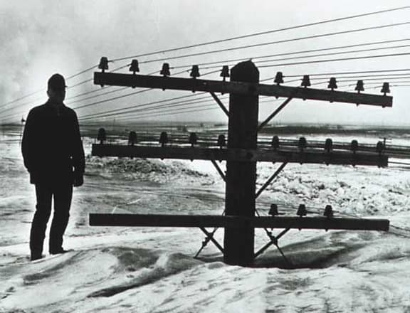
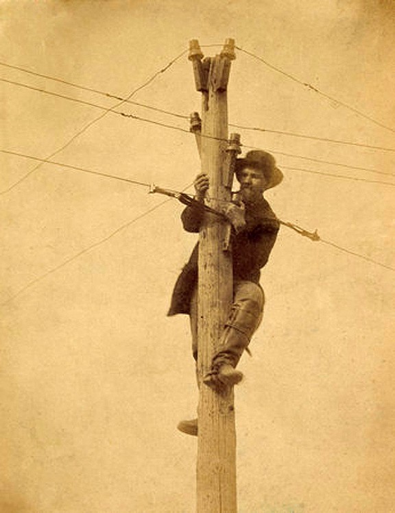
A Pole Full of Beehives

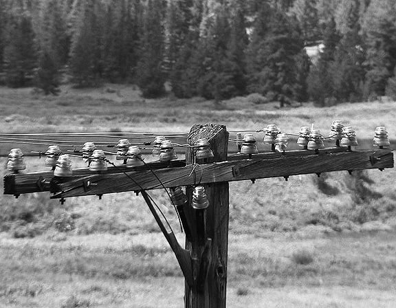
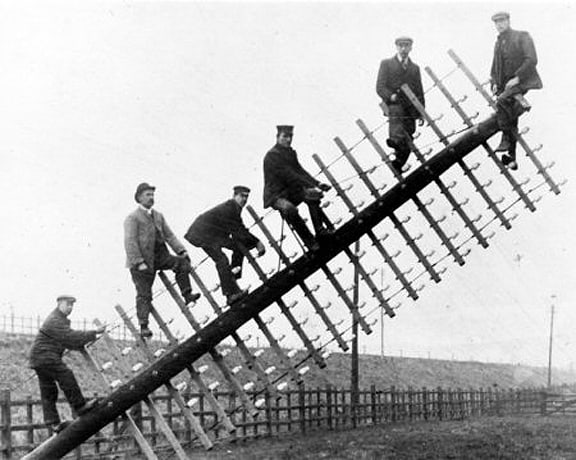
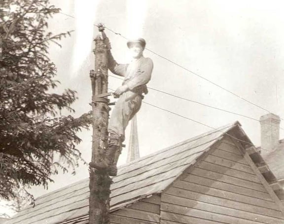
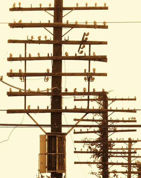
I saw this posting by James Bancroft on his facebook page of a large pole full of beehives (see below) of 152’s and 154’s.

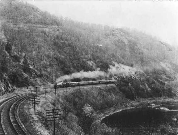
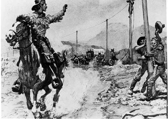
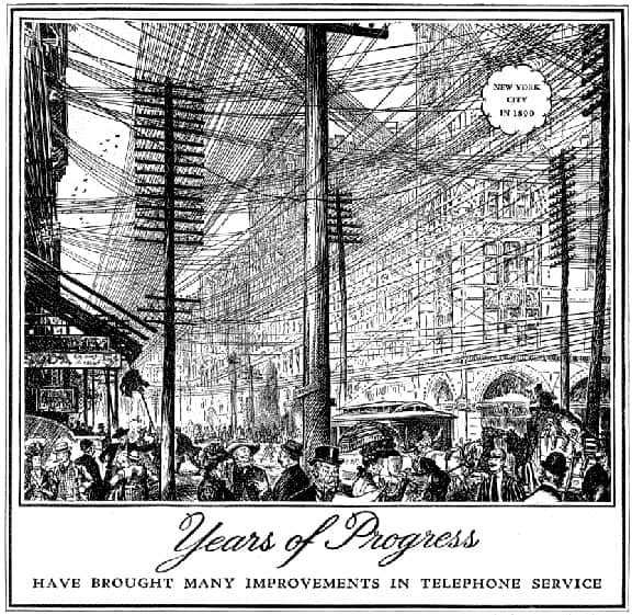
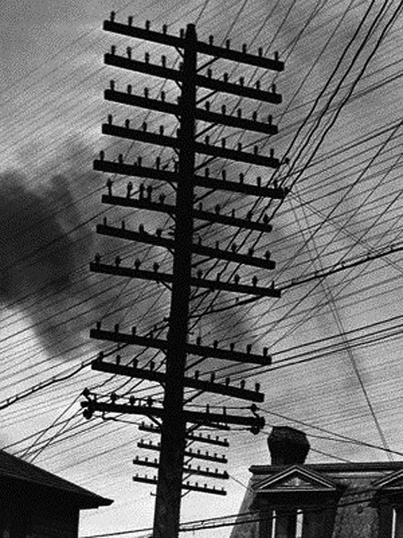
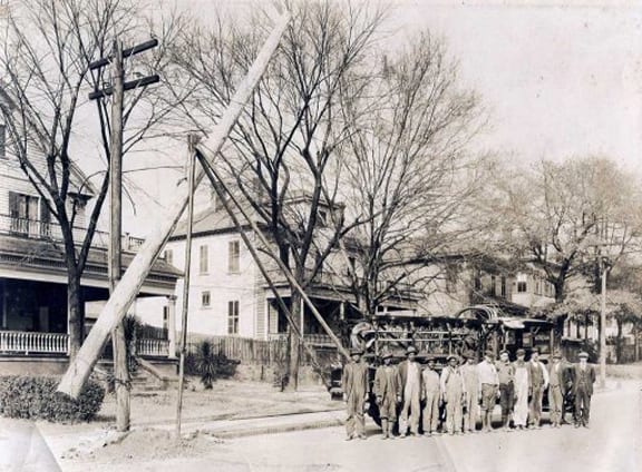
I thought this was pretty neat. A few weeks ago I also saw miles of old poles and insulators on my drive from Winchester, Virginia to Lurray, Virginia on the scenic Stonewall Jackson Memorial Highway. Beehive is a nickname for primarily CD 145’s.

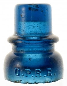
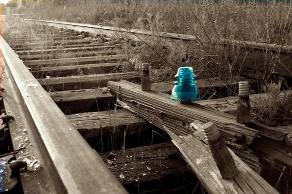
A style of insulator known as a “Beehive” insulator which were the standard insulator used for telegraph use along U.S. railroads. Beehive insulators were produced from the mid 1880’s to around the 1930’s time period.
 The beehive insulator was produced by the Western Glass Manufacturing Company (1900-1909) in Denver, Colorado, which was reorganized from the Western Flint Glass Company due to some part because of bad quality control.
The majority of W.G.M.CO. beehive insulators were used along railroads scattered around the Colorado area and some surrounding states.

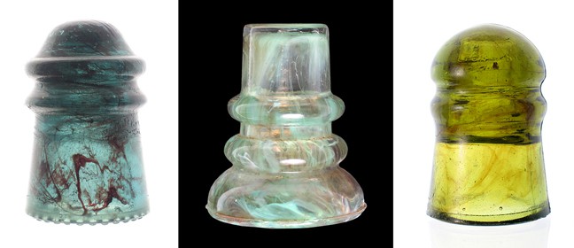
Most W.G.M.CO. insulators have a distinct purple color from years of exposure to the sun. These insulators were made from glass which contained manganese, a decolorizing agent used to produce clear glass. The more manganese in a glass batch and the longer the insulator was exposed to the sun the darker the insulator got, sometimes to a purple blackglass.

This got me thinking about my small collection of insulators and specifically Beehives. I reposted the pole picture from James and some other outstanding CD 145’s to spark our memories of the poles that used to hold this wonderful glass.

Large pole full of beehives, 152's and 154's - James Bancroft

Looking at the show calendar I see a major insulator show coming up in Connecticut on 25 March 2012 (Sunday) in Enfield, Connecticut. This is the Yankee Polecat Insulator Club, Antique Insulator, Bottle & Collectibles Show, (8:00 am to 12:00 pm) at the American Legion Hall, 566 Enfield Street (US Route 5), Enfield, Connecticut (Exit 49 off I-91). Bottles, Railroadiana, Telephone & Telegraph Collectibles, Lightning Rod Equipment, Free Admission. Info: John Rajpolt, rajpolt@earthlink.net

See link for National Insulator Association Convention and Show at bottom of post.

Insulators in Peach Ridge Office - Meyer Collection

Insulator Rows - Meyer Collection

An unusual and beautiful Beehive (CD 145) in a shade of Apple Green - circa 1900

CD 145, H. G. CO., Yellow Amber

CD 145, W. G. M. CO., Purple

CD 145 HGCO K mould in a blazing fizzy bubbly orange amber - Chris McClelland

National Insulator Association Convention and Show

Posted in Bottle Shows, Glass Companies & Works, Insulators, News, Peachridge Glass | Tagged , , , , , , , , , , , , , , | Leave a comment